
Saturday, July 31, 2010
Inking a Little Depth
Friday, July 30, 2010
Swirly Pearls

I love the soft tone of these papers from Fancy Pants Road Show line. They work nicely with the sepia photograph and give it a vintage touch.
Sunday, July 25, 2010
Taking Jolee's Out of the Package

Saturday, July 24, 2010
Crate Paper Static
It has been an interesting challenge to find boy papers that appeal to me. Once out of the baby blues and teddy bears of the infant styled papers, it seems most styles move on to cars and trains. While I like these papers just as well, it's nice to find a something a little more rockin' like the papers from Crate Paper's Static line. In natural tones accented with blues and greens, this line rocks out with guitars, stars, and surfboards while keeping some of the fun swirls so often used in scrapbooking. I used this fun line for a sketch challenge on the scrapbook social site A Cherry On Top for some fun photos of Jack and his guitar playing. I could also see this line easily used for scrapping road trips and beach photos.

Thursday, July 22, 2010
Guilt Free Cupcakes
I love cupcakes and there is nothing better than one that doesn't go to your hips and lasts forever! This little cupcake is a chipboard album by Bare Elements. The chipboard pieces are pre-punched and come with a ring to hold them together as an album. All I did was add Basic Grey cardstock, some American Crafts Thickers letters and am ready to add some photos of the kids baking cupcakes!


The Layered Look
I have been loving playing with flowers lately and my new thing is layering. With a huge collection of paper flowers, I started stacking different styles from different makers and have loved the results.


On these ones I actually inked the flowers individually with Tim Holtz Distress Ink in Tea Dye before stacking them together and attaching a brad. Then I attached the whole stack with a glue dot to a My Minds Eye chipboard flower from the Flirty Line which coordinates with the whole layout.

Monday, July 19, 2010
Cookin' Up a Recipe Box

I bought several little Provo Craft lunch tins several months ago at my local Joann's for $.97 each. Since then they have been sitting on my desk waiting for me to do something with them. While I had tons of ideas, it was like a blank canvas that I just couldn't get started with. Finally, after printing multiple recipes off allrecipes.com and having them get splattered, I decided a recipe box is just what I needed. I found these pretty papers from BoBunny which have a rustic look, added some Prima flowers and brads and ended up with a very pretty recipe box to add to my kitchen.


Sunday, July 18, 2010
Learning the Accordian

As I stated before, I love using flowers in my layouts and have been excited with all the new ways of making paper flowers that are out there. For this layout, I made flowers using an accordian fold and now I'm addicted! It's so simple and fun, and you can make them to coordinate with whatever patterned paper you are using. Here are the instruction to make your own accordian fold flowers.

4. Next, apply adhesive to one end of the strip and then stick it to the other end, creating a cylinder.

6. Pushing in toward the center, hold the bloom so the center hold is as small as possible and add hot glue or quick dry glue to the center, sealing with a circle of paper.
1. Cut a strip of patterned paper to the desired size. A 1" cut results in about a 2" flower.

2. Score the paper and 1/4" intervals. I used the gutter on my paper trimmer and an embossing tip.
3. You will not have a strip with folds all down the length of it. Fold the strip like a fan from end to end.


5. Now, decide which side you want to be the back. This is the side that should be facing out. Push the paper down toward the center to create the bloom shape.


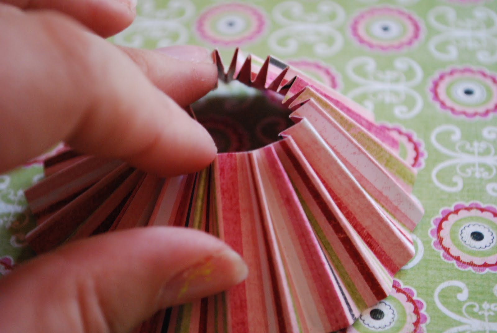

7. Let this set then turn over and embellish the center.

These flowers are so simple and can be used for a variety of projects from layouts to cards!


Friday, July 16, 2010
Hey these gears look just like flowers!
I have been scrapbooking my 8 year old daughter Hannah the longest since she is the oldest. The result is that I have become very good at scrapping with lots of ribbon and flowers and bling. When our second child Jack came along, I had to adopt blues and planes and cars.
While heavy equipment can be fun and there are a variety of blues, I have had the hardest time finding an embellishment the equivalent of flowers to use on my layouts.
That is, until I discovered painting chipboard! The bold shapes of chipboard are easily manipulated into masculine embellishments and paintable or coverable with paper in whatever cover suits your need!

In this recent layout, I used BoBunny's Grease Monkey collection of papers and cardstock stickers to create this layout of Jack in my husband Luke's kite boarding gear.
I used the orange paper for the background and was inspired by the white "painted" edges so I took the patterned pieces, cut them into smaller pieces, and edged them in white paint. I then took chipboard gear coasters by Maya Road and painted them coordinating colors of orange, blue, and green, let them dry, and added a distressed look with black dry brushed paint.


For additional dimension, I added foam squares to the back of cardstock stickers to lift them off the page. The orange letters for the title are traced with white gel pen to add some dimension to the title as well.

This page has the visual effect of floral embellishments, but with a masculine feel.

Welcome to my blog!
So this is day one of my scrapbooking blog. I've kept a family blog in the past with photos and stories but really wanted to keep something separate for my scrapbooking habit.
I have a few goals and hope that perhaps putting them in writing makes it more important and increased the liklihood that I will stick to them.
For one, as long as I have been scrapbooking, and it has been a long time, I've never submitted anything seriously for publication or tried to be on a design team. I think the main reason is that I had not really thought about it until several people asked if I had been published. I love talking with and sharing my hobby so I think this blog may be the perfect outlet and lead me to my goals!
Subscribe to:
Posts (Atom)